Final Frames
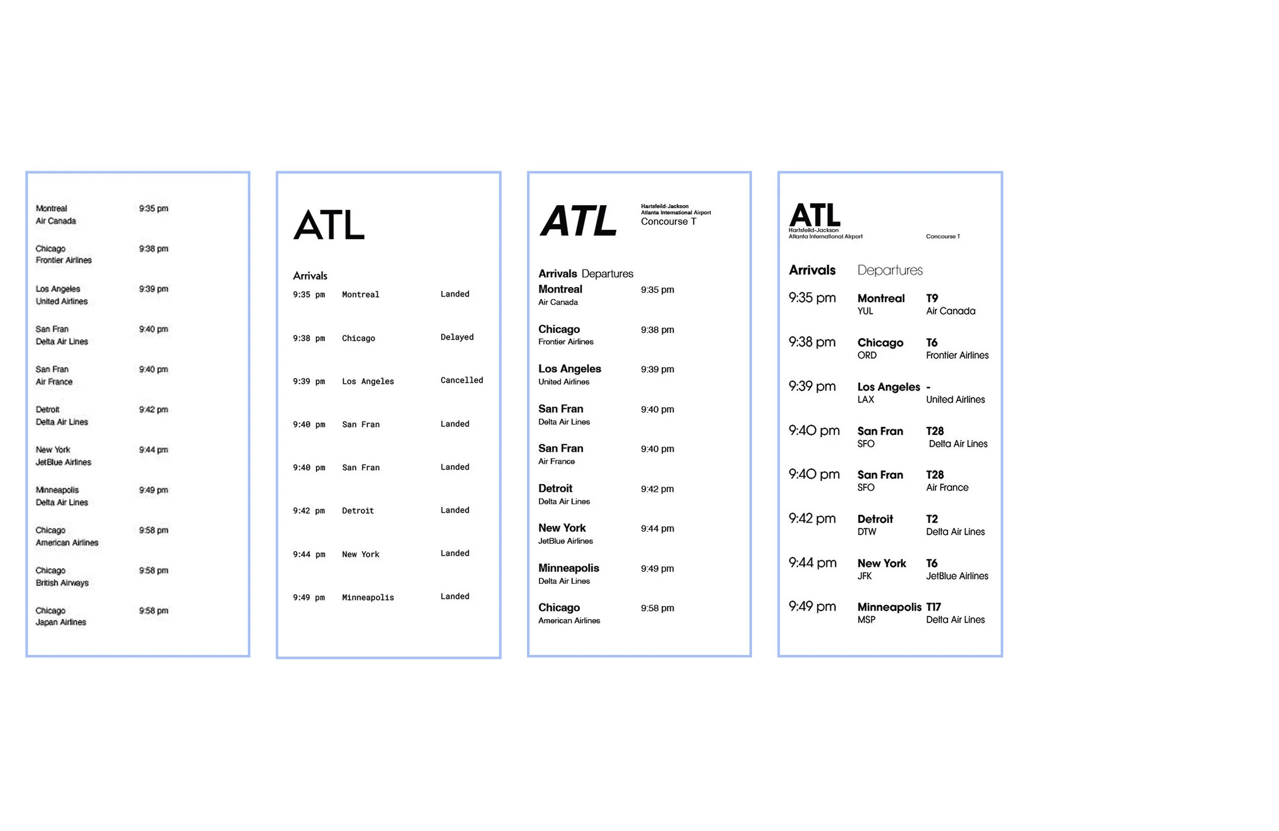
Process: Wire Frames
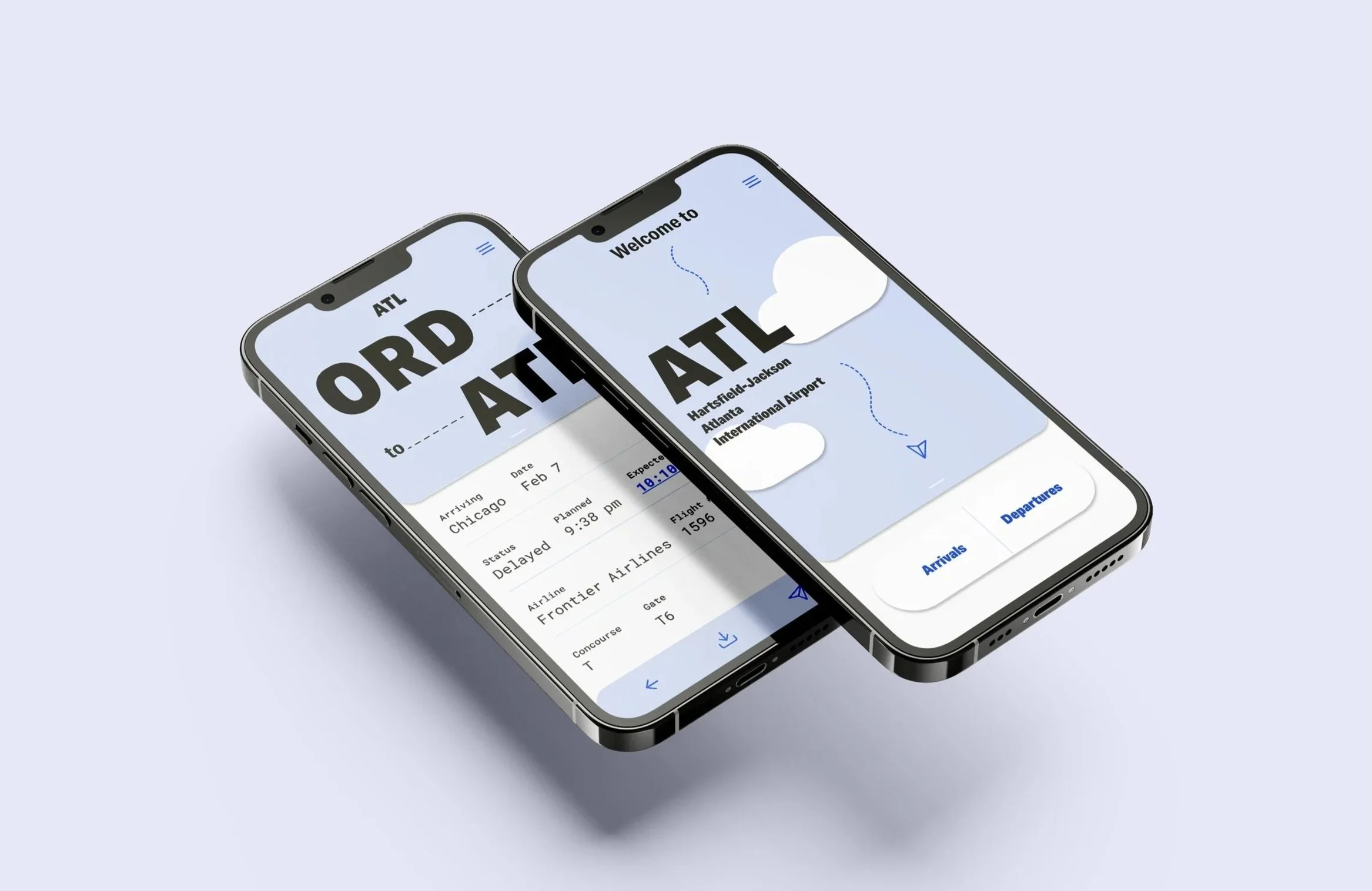
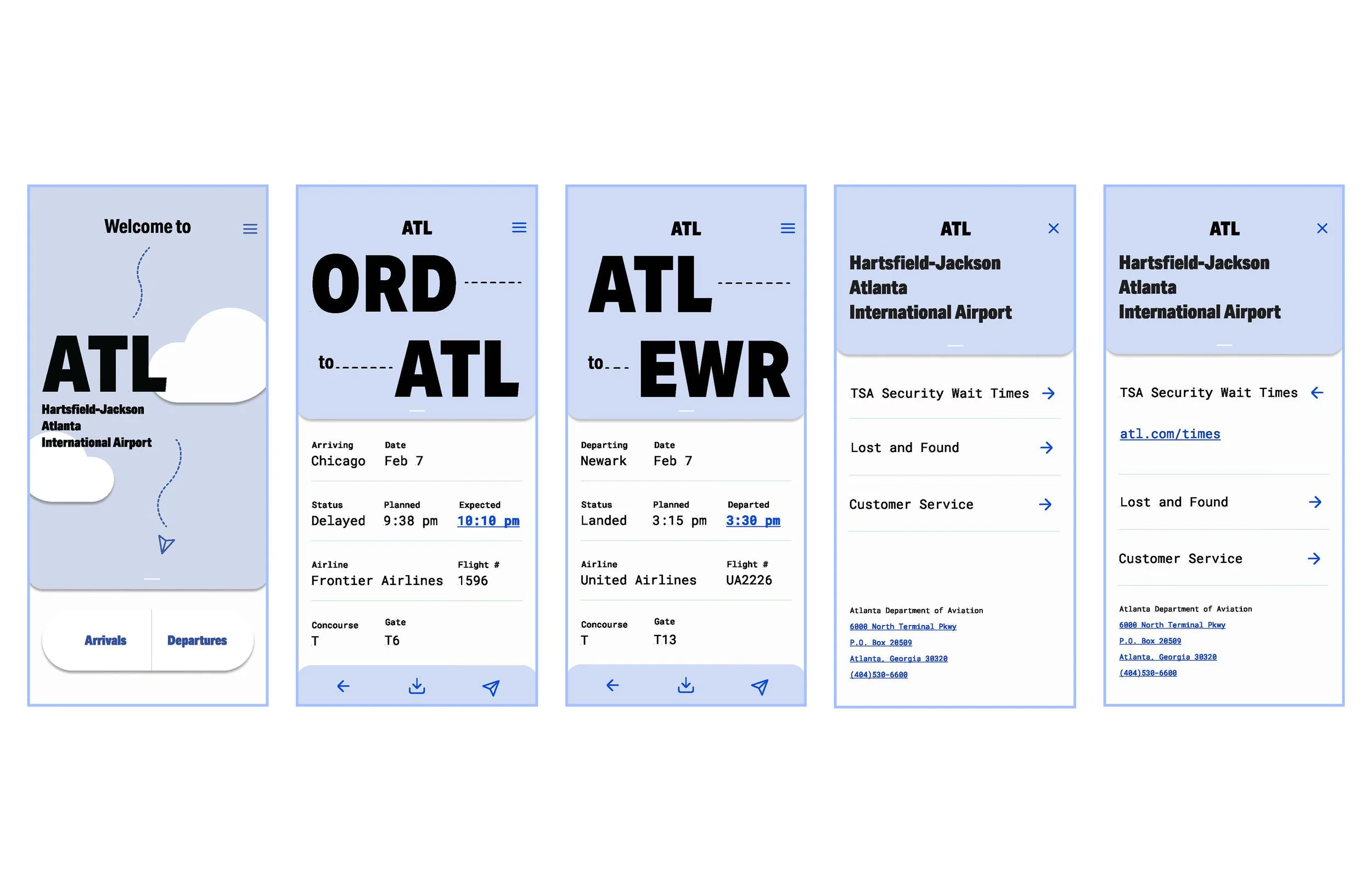
Atlanta Airport Redesign
This assignment focused on organizing information clearly to improve communication. By studying typefaces, grid layouts, and hierarchy, the goal was to make text easier to read, guide viewers, and create unified layouts. Analyzing typography showed how fonts influence tone and clarity, while grids helped balance space. The project produced a clear, updated design system for the Atlanta International Airport.
I started my process by creating wire frames and experimenting with the layout of different parts of information. Then I started using different weights to differentiate information hierarchy.
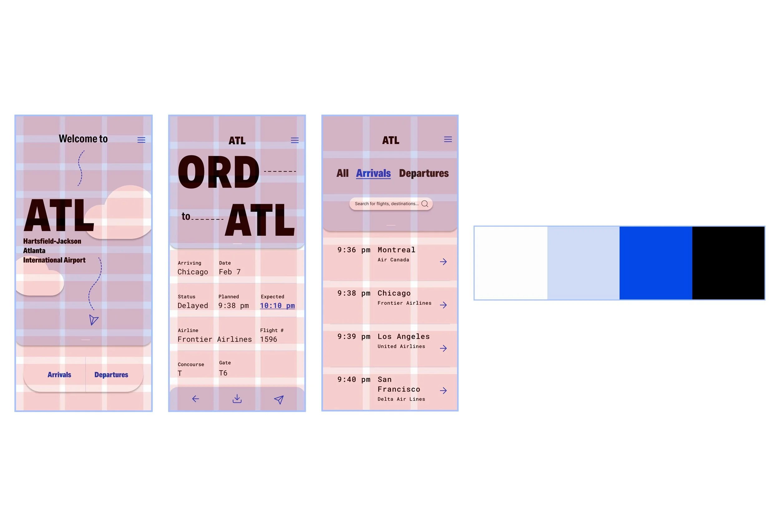
Process: Color and Shape
I continued critiquing the organization of information and applying a color scheme. I wanted to keep the color palette simple and calming. I tried using a monochrome with whites and blacks with use of color only for specific flight information. I felt it was not enough for a brand identity system so I decided on white, black, and a selection of blues.

Process: Final Grid and Color Scheme
Final Prototype Video
Final Mockup